
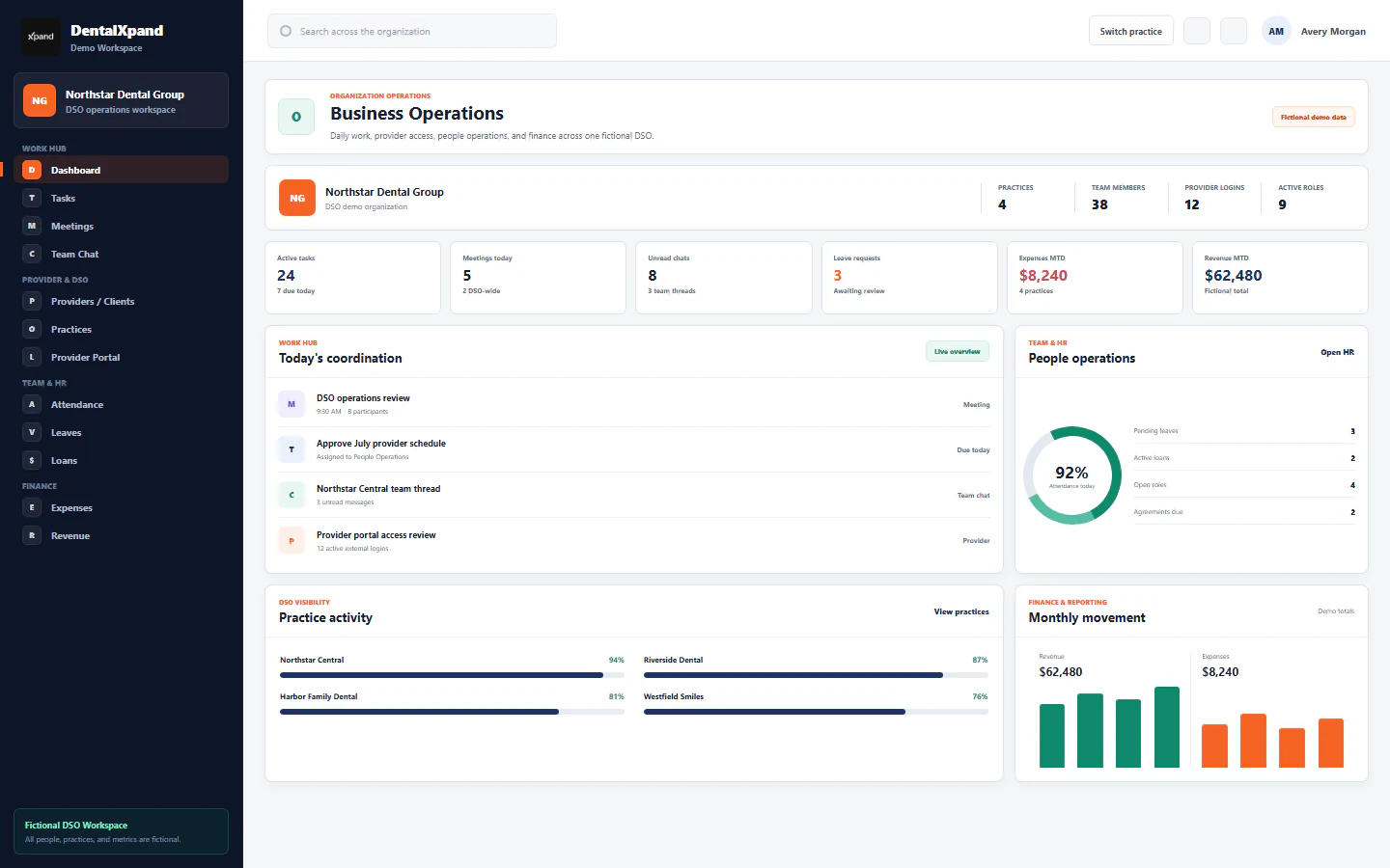
Navigate sections and pin frequent tools
Use role-aware sidebar sections, active-page cues, personal pinned shortcuts, collapsed desktop navigation, and the mobile drawer without confusing navigation visibility with authorization.
DentalXpand builds navigation from the signed-in user’s organization context, role, department, and page permissions. This guide teaches the standard internal sidebar, its personal Pinned shortcuts, the compact provider and platform menus, and the responsive controls used on desktop and mobile.
01 / Navigation models
Map the three navigation models
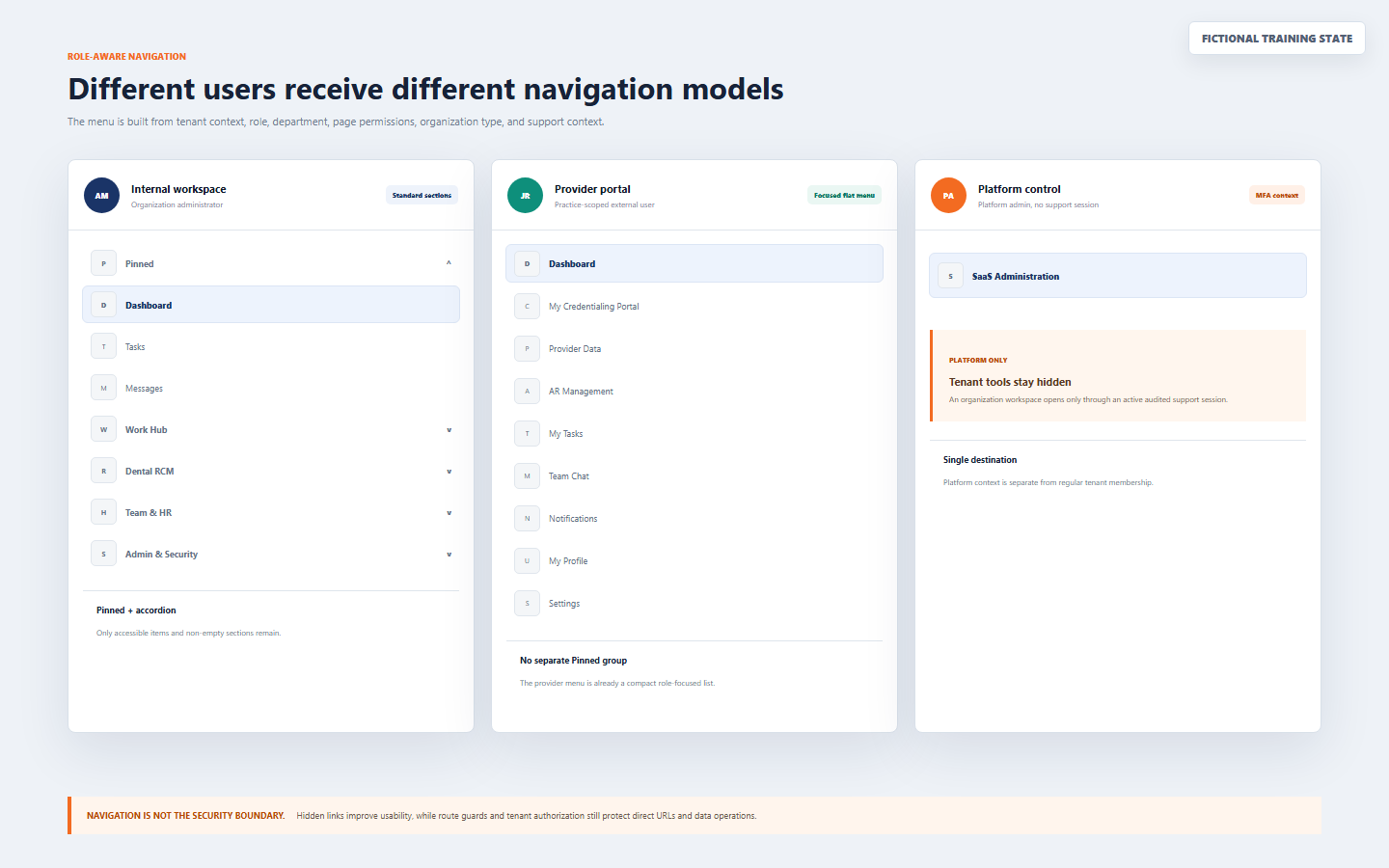
| Context | Navigation model | What to expect |
|---|---|---|
| Internal organization workspace | Pinned shortcuts plus expandable sections | Only accessible, non-empty sections and destinations remain; the active section opens automatically |
| Provider, client, practice, customer, or external portal | Focused flat menu | A compact role-specific destination list without a separate Pinned group |
| Platform administration without active support context | Platform-only flat menu | SaaS Administration remains separate from tenant tools until an authorized support session starts |
The instructions about the expandable Pinned group apply to the standard internal organization workspace. Provider and platform users should follow their focused menu instead of expecting the same section layout.
02 / Orientation
Orient yourself after every sign-in or context change
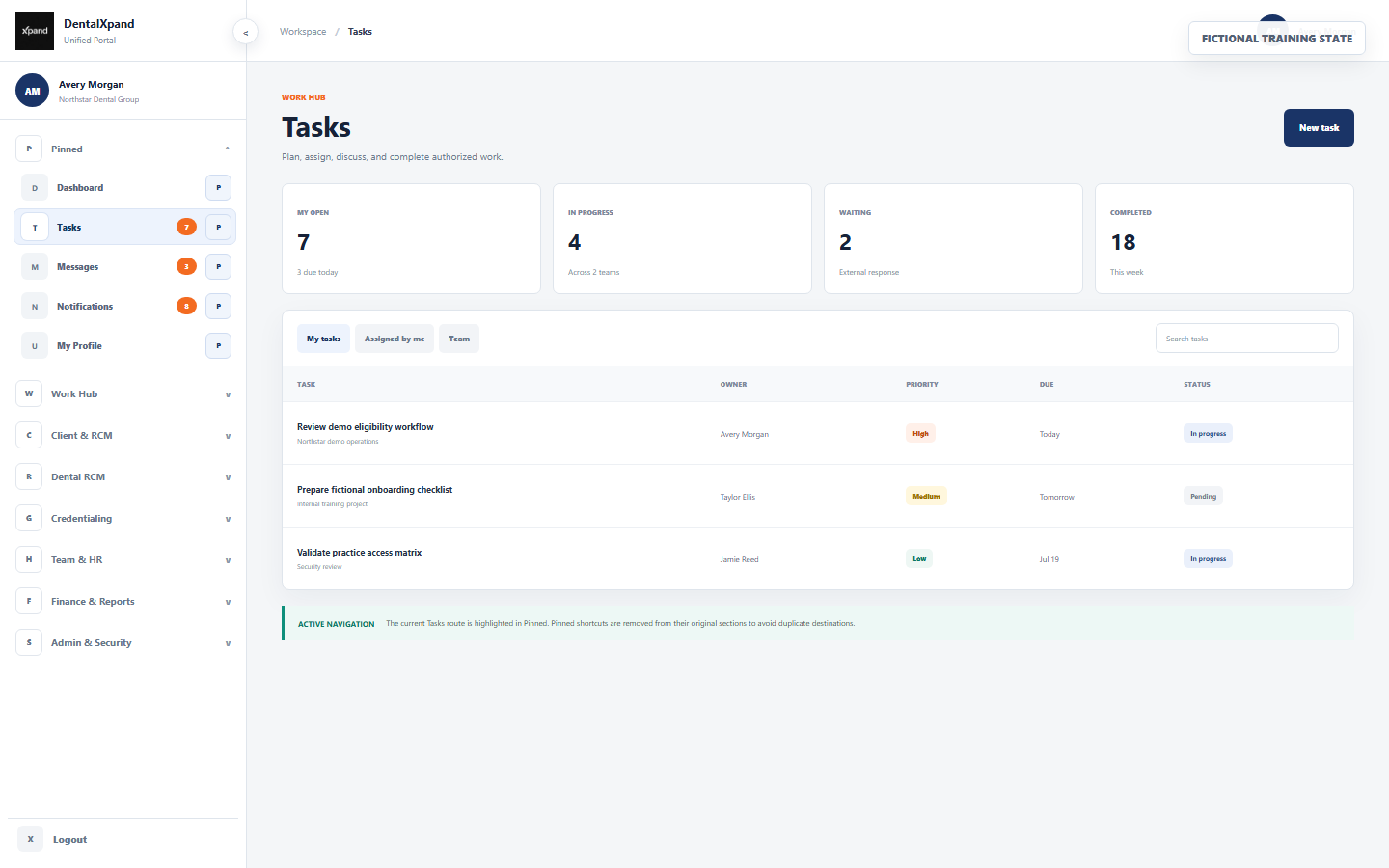
- Confirm the identity.Read the signed-in user’s name or initials. Use only your own authorized account.
- Confirm the organization.Check the organization name before opening work, files, records, reports, exports, or AI tools.
- Read the header path.The header shows Workspace and the current page, or Platform when the platform context is active.
- Find the highlighted destination.The active row and parent-section cue show where the current route belongs.
- Review only relevant badges.Counts and labels indicate pending work or feature state; they do not change access.
03 / Internal sections
Understand the standard internal sidebar sections
An internal user can receive the sections below. DentalXpand removes empty sections and filters each destination by role, department, page permission, organization type, and other feature-specific conditions.
| Section | Typical purpose | Important behavior |
|---|---|---|
| Work Hub | Dashboard, tasks, meetings, chat, documents, notifications, and profile workflows | Daily destinations commonly used across departments |
| Client & RCM | Client, practice, provider, billing, and shared revenue-cycle workflows | The practice label adapts to organization type |
| Dental RCM | Eligibility, verification, VOB, AR, claim, and payer workflows | Only authorized RCM destinations remain |
| Credentialing | Provider data, cases, documents, submissions, follow-ups, and reporting | Role and credentialing permissions shape the list |
| Marketing & Growth | Lead research, scraper jobs, outreach, calling, and pipeline work | Marketing-only checks may apply in addition to page permission |
| Team & HR | Teams, employees, attendance, leave, loans, recruitment, and notices | Long section content has its own scroll area |
| Finance & Reports | Expenses, revenue, invoices, analytics, and exports | Finance and management access may be required |
| Admin & Security | Users, roles, permissions, practices, settings, audits, and system controls | Administrative destinations are not ordinary user shortcuts |
| AI & Automation | Xpand AI and approved automation helpers | Tenant, role, source, and deployment configuration still apply |
| System | Available system or desktop operations | Visible only when the current context qualifies |
04 / Accordion
Expand and collapse one work section at a time
Its authorized destinations open directly beneath the heading.
The newly selected standard section opens and the previous standard section closes.
The current standard section closes when you need a shorter list.
DentalXpand opens the section containing the current page and closes other standard sections.
The Pinned group remains at the top and does not collapse like a standard section.
Use the sidebar scroll; Team & HR also has a bounded internal scroll for its longer destination list.
If a route is not represented in the current menu, the existing open-section state can remain unchanged. This does not mean the unlisted route has been granted.
05 / Active cues
Read the current-page state and workload badges
The current destination receives a blue-tinted state and an emphasized icon chip.
The parent section receives an active marker, including when labels are hidden in collapsed mode.
Most destinations remain active for their nested child routes; Dashboard requires an exact match.
Counts above 99 display as 99+ in expanded navigation.
| Badge | Meaning | Collapsed presentation |
|---|---|---|
| Tasks | Pending and in-progress task count available to the current user | Compact orange dot; value appears in the tooltip |
| Messages | Unread conversation count | Compact orange dot |
| Notifications | Unread notification count | Compact orange dot |
| Leaves | Pending leave count for the current authorized workflow | Compact orange dot |
| Xpand AI Beta | Feature-state label rather than a workload total | Compact indicator with tooltip context |
Badges help prioritize work; always open the destination and confirm its filters, organization, practice, owner, and status before acting.
06 / Pinned defaults
Start with five common shortcuts
The standard internal workspace initializes Pinned with these destinations when no saved preference exists:
Return to the authorized workspace overview.
Open assigned and team work queues.
Reach team conversations and unread messages.
Review relevant alerts and linked actions.
Open the signed-in user’s own profile and personal context.
Pinned destinations are removed from their original sections to avoid duplicate links. Unpinning returns an accessible destination to its normal section.
07 / Pin workflow
Pin or unpin a frequent destination
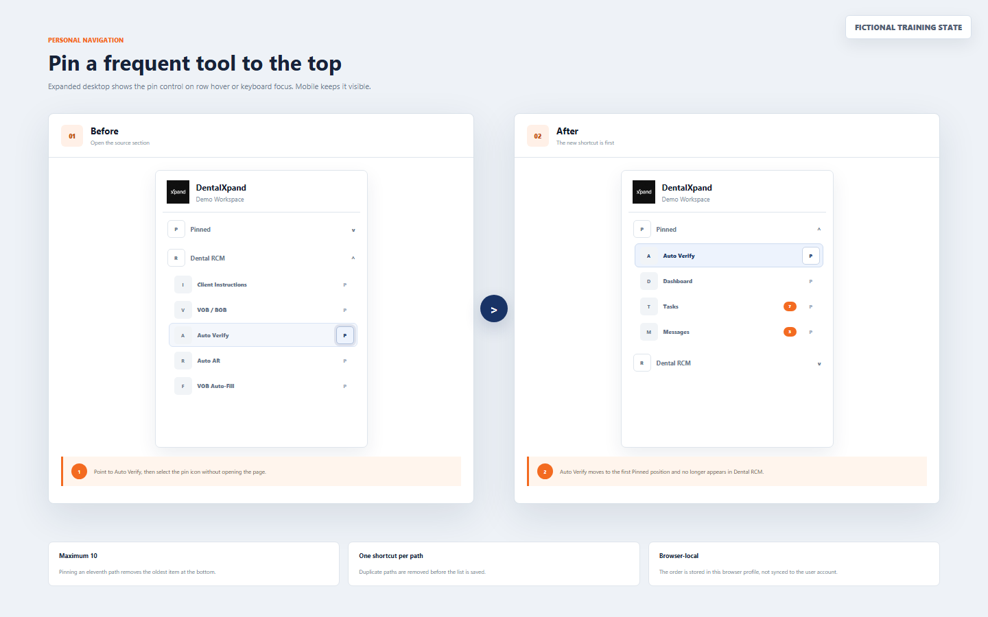
- Expand the desktop sidebar.Pin controls are intentionally hidden in the 64px collapsed desktop rail.
- Open the source section.Locate the authorized destination you use frequently.
- Reveal the pin control.On expanded desktop, hover over the row or move keyboard focus into it. On mobile, the control remains visible.
- Select the pin icon.The destination moves to the first position under Pinned without opening the page.
- Verify the result.Confirm there is one shortcut only and it no longer appears in the source section.
- Unpin when no longer frequent.Select the filled pin control under Pinned; the accessible destination returns to its normal section.
08 / Pin rules
Control shortcut order, limit, duplicates, and access changes
| Rule | Exact behavior | User response |
|---|---|---|
| Maximum | Up to 10 pinned paths are saved | Keep only frequently used destinations |
| New pin position | A newly pinned destination is placed first | Expect the newest shortcut at the top |
| Eleventh pin | The oldest item at the bottom is removed from the saved 10-item list | Review the bottom item before adding another shortcut |
| Duplicate path | Duplicate paths are removed before preferences are saved | Do not expect two shortcuts to the same destination |
| Permission removed | An inaccessible saved path is filtered from the visible Pinned group | Ask an administrator only when there is a valid business requirement |
| Permission restored | A previously saved path may become visible again when access returns | Reconfirm context and required access before use |
DentalXpand filters the shortcut list against destinations currently available to the user. A stored path is never a way to preserve unauthorized access.
09 / Persistence
Understand what this browser remembers
Remembered locally
- Pinned destination paths and their order.
- Expanded or collapsed desktop sidebar preference.
- Preferences in the current browser profile and site storage.
- Accessible shortcuts after each permission-aware rebuild.
Not synchronized by Pinned
- No server-side account preference.
- No automatic transfer to another browser or computer.
- No permission, role, organization, practice, or record change.
- No guarantee after browser site data is cleared.
Clearing site data resets navigation preferences. This is an interface reset, not an account-access fix.
10 / Collapsed desktop
Use the 64px icon rail when more workspace width is needed
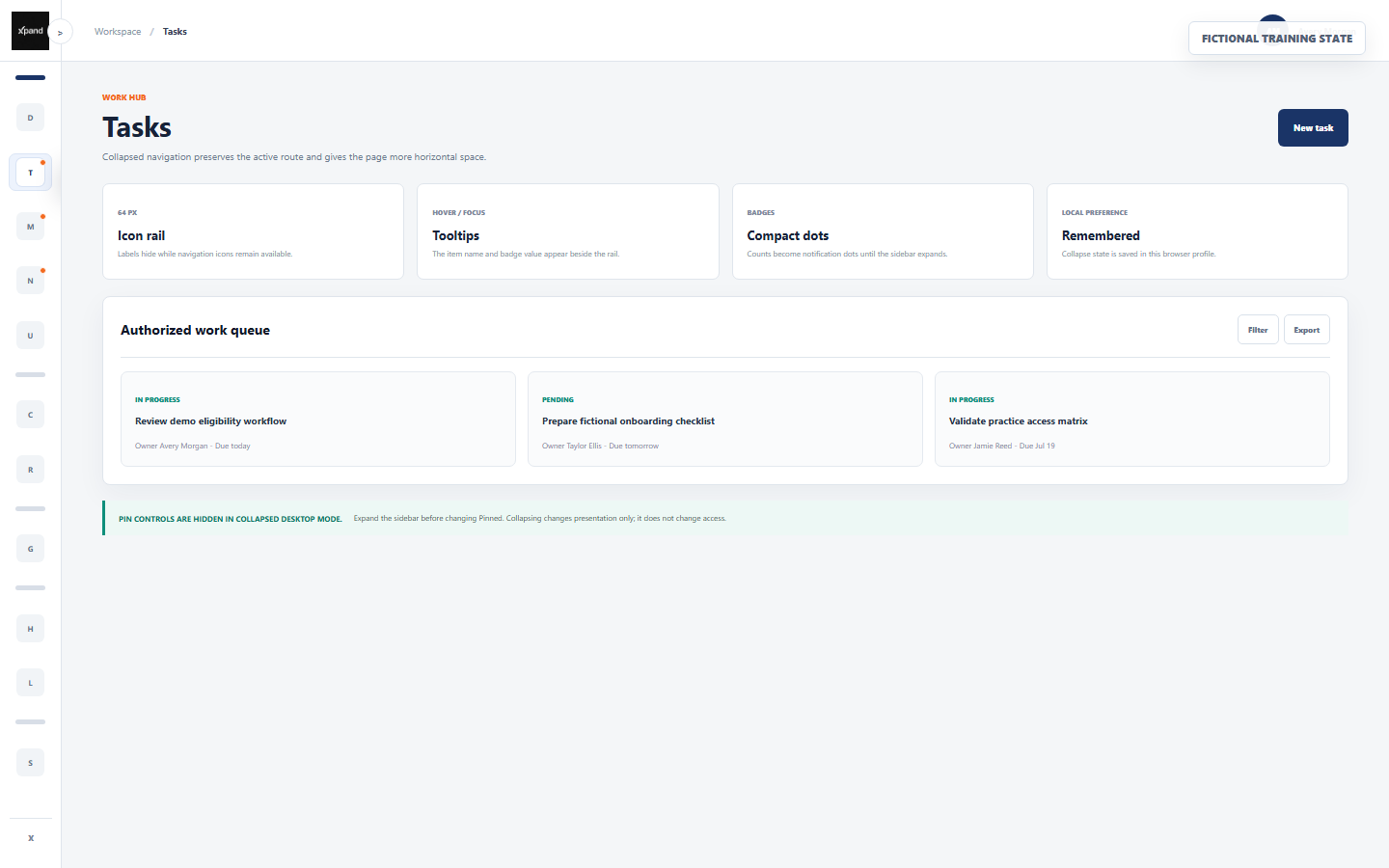
The desktop sidebar uses a 256px text-and-icon layout.
The desktop sidebar becomes a stable 64px icon rail.
Hover or focus reveals destination labels and available badge context.
The current browser profile remembers the collapsed preference.
- Select the sidebar toggle.The main workspace margin adapts to the compact rail.
- Use section separators.Section headings become visual separators and all accessible destination icons remain beneath them.
- Read active and badge dots.The current route remains emphasized and numeric badges become compact orange dots.
- Use tooltips before selecting.Pause over or focus an unfamiliar icon to confirm its label.
- Expand before editing Pinned.Pin controls are hidden in collapsed desktop mode.
11 / Mobile drawer
Use responsive navigation below 1024px
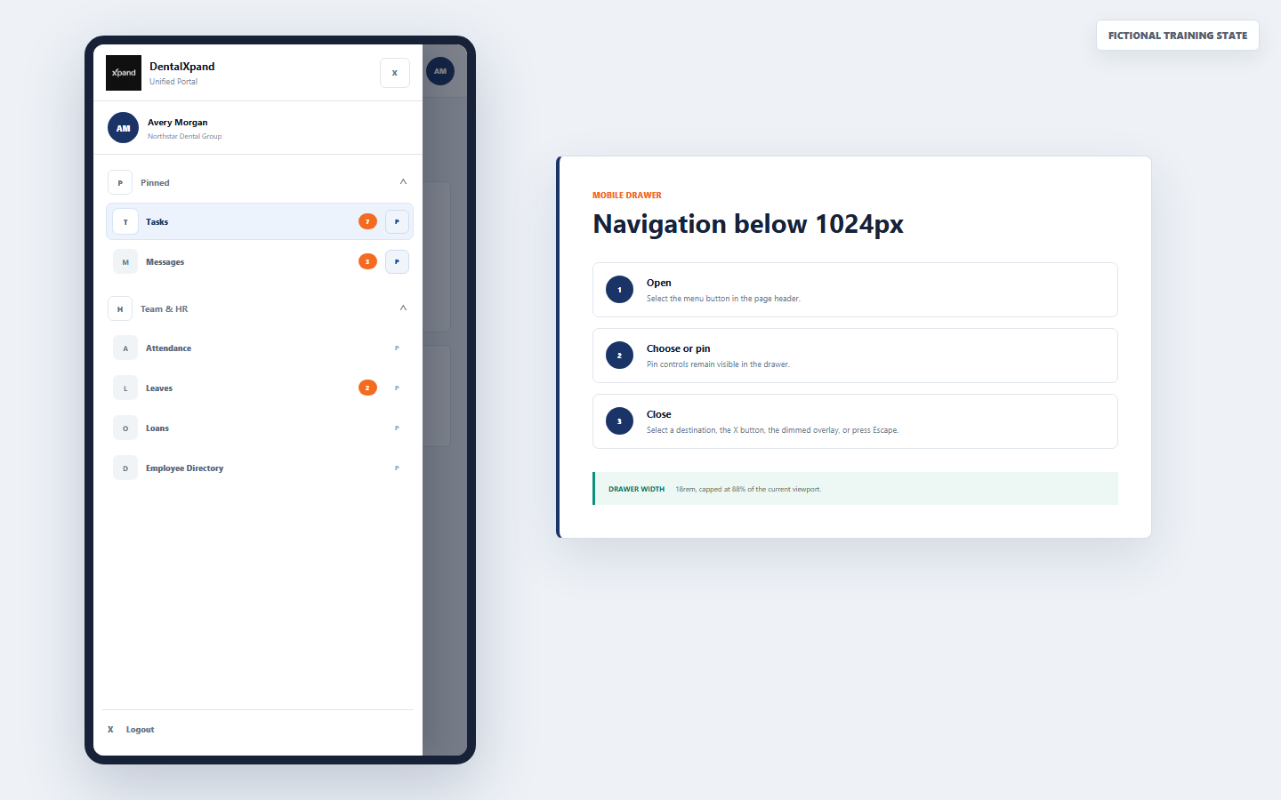
- Open the menu.Select the navigation button in the page header.
- Confirm context.Read user, organization, active destination, and section labels before acting.
- Expand a section.Use the same one-section-at-a-time accordion model as expanded desktop.
- Pin when needed.Pin controls remain visible on mobile rows, so no hover is required.
- Select a destination.The drawer closes after navigation so the page can use the viewport.
- Close without navigating.Use the X button, select the dimmed overlay, or press Escape.
The drawer is 18rem wide and capped at 88% of the current viewport, preserving a visible overlay target. Resizing back to desktop closes an open mobile drawer.
13 / Keyboard and focus
Navigate without relying on hover
Use Tab and Shift+Tab to move through the header, section controls, destination links, and available pin buttons.
Use Enter or Space according to the focused link or button’s standard browser behavior.
Focusing an icon can reveal the same tooltip label and badge context available on hover.
Moving focus into an expanded destination row exposes its pin action.
Press Escape when the mobile drawer is open.
Use browser zoom responsibly and expand the sidebar when icon-only navigation is unclear.
Do not depend on color alone: read labels, tooltips, header path, section position, and destination text together.
14 / Authorization
Respect the boundary behind the menu
Correct response
- Use only visible destinations required for assigned work.
- Ask an authorized administrator to review a legitimate missing-access need.
- Re-sign in after an approved permission change and verify the result.
- Report unexpected data or context before continuing.
- Use separate individual accounts and approved support sessions.
Unsafe workaround
- Guessing or copying a hidden direct URL.
- Using another person’s administrator account.
- Changing browser storage to reveal a destination.
- Pinning a path as proof that access should continue.
- Broadening a role only to simplify navigation.
Continue to roles, permissions, and access boundaries for the next authorization lesson.
15 / Troubleshoot
Troubleshoot navigation without bypassing controls
| What you see | Likely reason | Correct action |
|---|---|---|
| A section or page is missing | Role, department, page permission, organization type, focused portal menu, or support context does not include it | Confirm the business need and ask an authorized administrator; do not guess the URL |
| Pinned returned to defaults | Site data was cleared, a new browser profile/device is in use, or storage was reset | Re-pin only the currently required accessible destinations |
| Pinned order belongs to another user | The same browser profile was shared | Use separate profiles, sign out, and build your own local shortcut list |
| A pinned item disappeared | The path is no longer available through the current menu filters | Verify role, permission, organization, and context with an administrator |
| A newly pinned item replaced one | The 10-item maximum removed the oldest bottom shortcut | Review and maintain a smaller frequent-tool list |
| Pin icons are missing on desktop | The sidebar is collapsed, or the row has not received hover/focus | Expand the sidebar, then hover or focus the intended row |
| Only icons are visible | Collapsed desktop mode is active | Use tooltips or expand to the 256px labeled sidebar |
| Mobile menu covers the page | The responsive drawer is open | Select a destination, X, the dimmed overlay, or Escape |
| Provider has no Pinned section | The focused provider portal uses a flat menu | Use that compact menu; do not request internal access for shortcut convenience |
| Platform tools appear but tenant tools do not | No active authorized tenant support context | Use the documented support-session workflow when support access is approved |
| Unexpected organization or records appear | Wrong account, stale or incorrect context, membership problem, or security incident | Stop, sign out, and report without inspecting further data |
| The menu changed after access update | Permission-aware navigation was rebuilt | Verify the approved change after a fresh sign-in; report any overbroad result |
For account-access problems, review Sign in and access your account or contact support@xpand.dental without sending passwords, recovery links, tokens, or sensitive records.
16 / Verify
Verify that navigation is understood
Practical verification
- I can identify my user, organization, header path, active row, and active section.
- I understand why only authorized, non-empty sections and destinations appear.
- I can expand one standard section at a time and use the always-open Pinned group.
- I can pin, unpin, and verify a shortcut without creating a duplicate destination.
- I know the five defaults, 10-item maximum, newest-first order, and oldest-item removal rule.
- I understand that pin and collapse preferences are local to this browser profile.
- I can use tooltips and compact badge dots in collapsed desktop navigation.
- I can open and close the mobile drawer through every supported method.
- I know why provider and platform menus differ from the standard internal sidebar.
- I understand that navigation visibility never replaces tenant, route, action, or record authorization.
Open the configured DentalXpand application and complete the verification using your own authorized account and non-sensitive workspace data.
Need workflow support?